
How to Match Neon Signs with Your Home Decor
Quick Answer:
Matching neon signs with your home decor comes down to balance. A neon sign should complement the room’s style, scale, and lighting rather than dominate it. Choosing the right size, color, and placement—especially with a custom neon sign—helps ensure the glow enhances the space instead of overwhelming it. Neon works best as an accent, not a replacement for good interior design.
How to Match Neon Signs with Your Home Decor
Neon signs were once closely associated with storefronts, bars, and nightlife districts. In recent years, they have moved into private homes as a form of expressive lighting and visual accent. In residential spaces, neon is no longer about advertising—it is about atmosphere, identity, and mood.
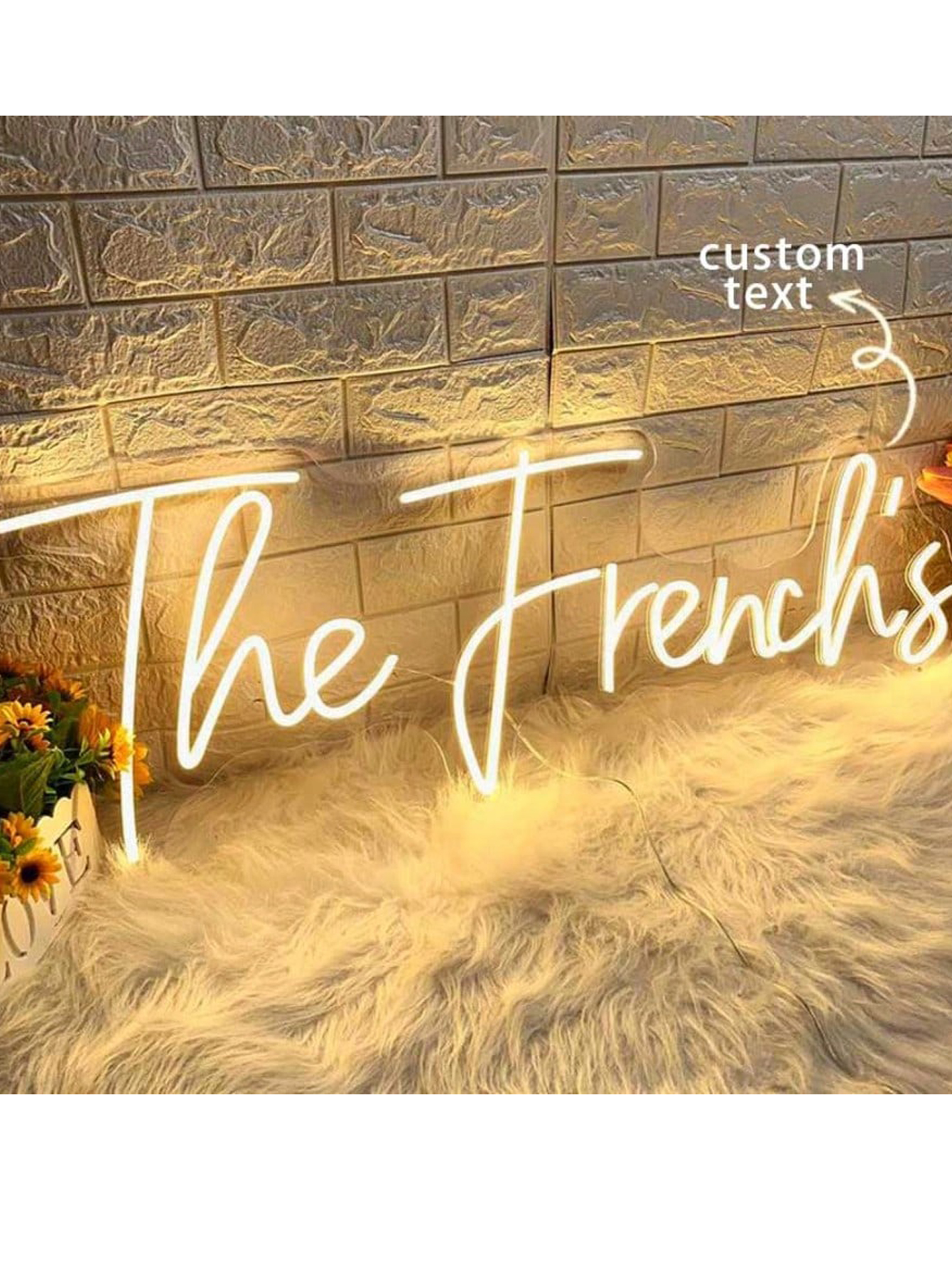
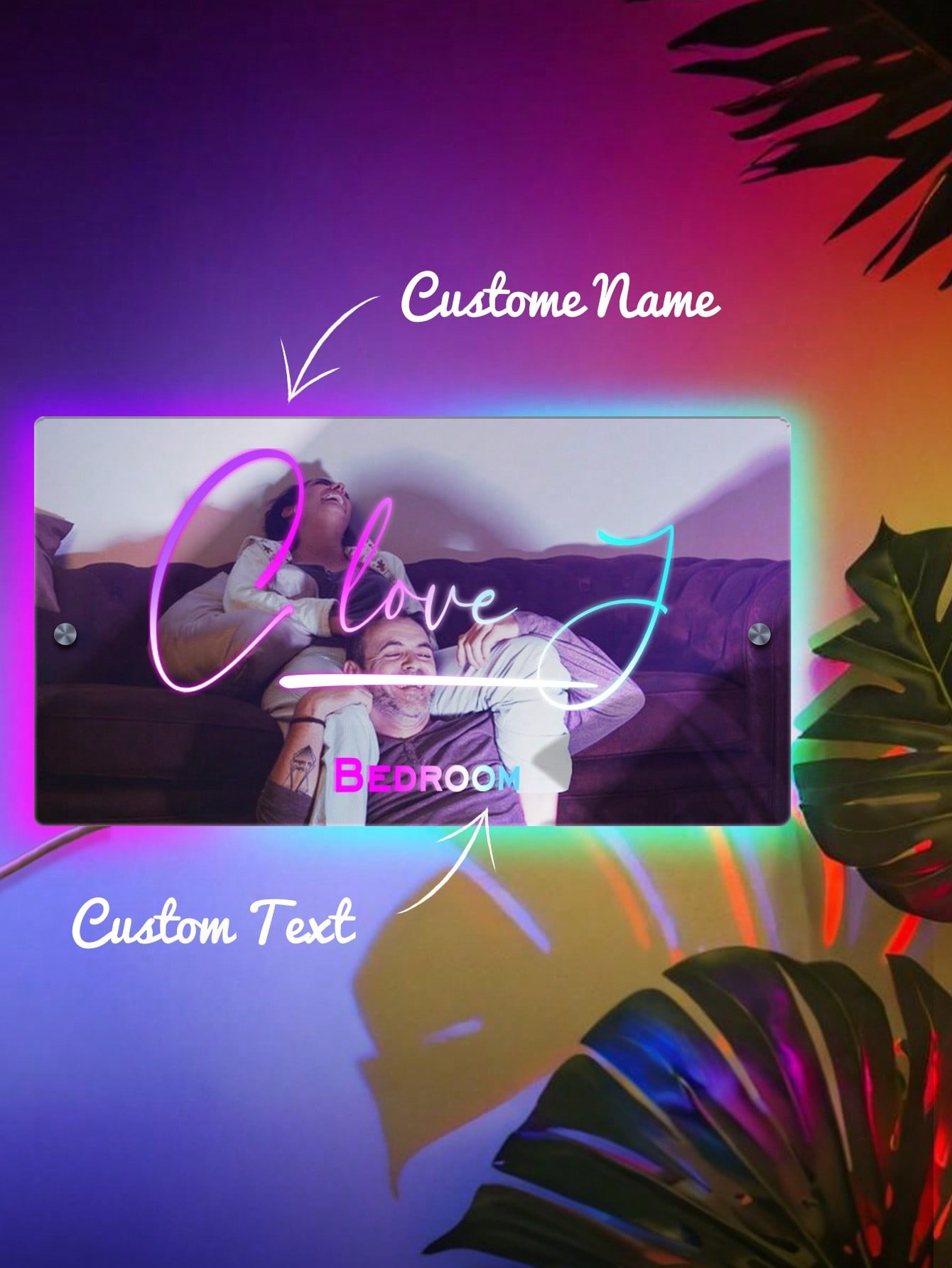
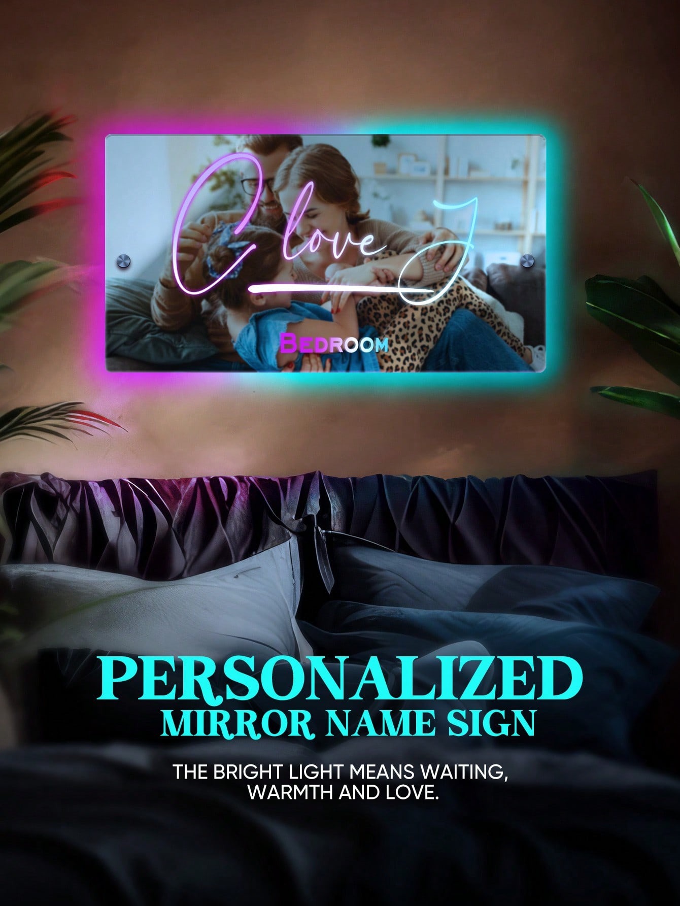
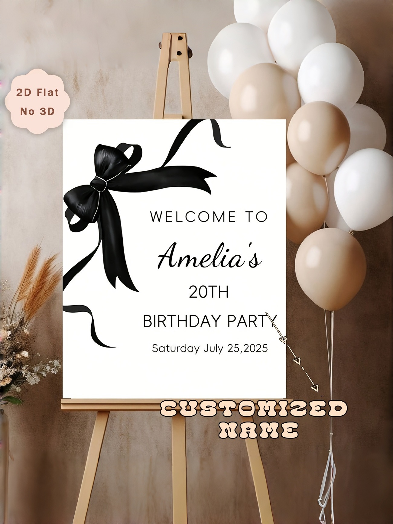
Unlike mass-produced wall art, a custom neon sign allows homeowners to choose specific words, symbols, colors, and proportions that reflect personal taste. That flexibility is also what makes neon challenging. Without thoughtful integration, even a personalized sign can feel distracting or visually out of place.
This guide explains how to match neon signs with different interior styles, what to consider before choosing a custom neon sign, and where neon tends to work—or fail—in real homes.
Why Neon Signs Can Work in Home Interiors
Neon signs differ from traditional decor because they emit light rather than reflect it. This makes them both a visual feature and a lighting source. When used carefully, a custom neon sign can help define mood, draw attention to a specific area, or add warmth without relying on overhead lights.
However, neon is not neutral by nature. Even soft LED neon attracts the eye. In rooms that already contain strong colors, bold artwork, or complex textures, neon can feel excessive rather than complementary.
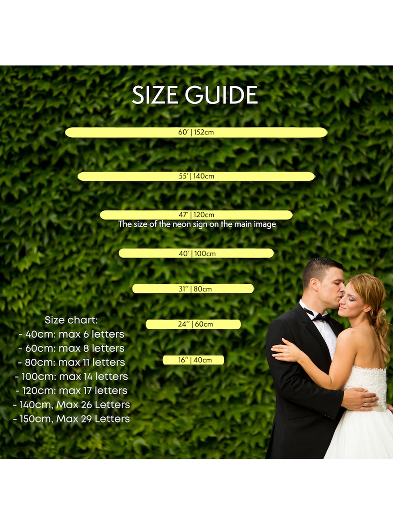
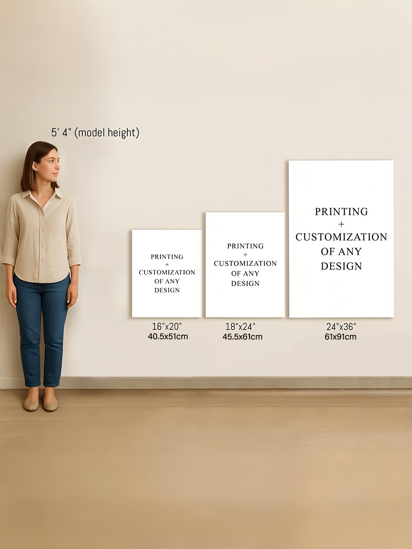
Scale and Proportion: A Common Issue with Custom Neon Signs
One of the most common mistakes in home neon decor is incorrect sizing. Because neon glows, it often appears more dominant than expected once installed.
Before committing to a custom neon sign, consider:
-
Wall width and ceiling height
-
Nearby furniture size
-
Typical viewing distance
A sign that looks modest online may overpower a small room, while a small sign can feel insignificant on a large feature wall. Proper measurement and visualization are essential.
Matching Custom Neon Signs with Interior Styles
Modern Minimalist Interiors
Minimalist spaces prioritize simplicity and visual calm. In these rooms, a custom neon sign should be subtle and restrained.
Best practices include:
-
Thin, clean fonts
-
Neutral tones like warm white
-
Short words or abstract symbols
In this context, neon should act as soft accent lighting rather than decorative art.
Downside:
Even minimal neon can disrupt a minimalist space if it becomes the primary visual focus.
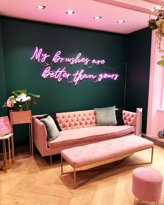
Contemporary and Luxury Interiors
Luxury interiors emphasize balance, texture, and refinement. Neon can work here, but only in a supporting role.
Suitable choices include:
-
Soft cursive lettering
-
Muted pastel or warm tones
-
Names, initials, or understated phrases
Bedrooms and private areas tend to be more suitable than formal living rooms.
Downside:
If the design feels playful or novelty-driven, a neon sign may clash with premium materials and finishes.
Eclectic and Bohemian Spaces
Eclectic interiors allow more creative freedom. A custom neon sign can coexist with layered decor, artwork, and plants.
Curved shapes, abstract designs, and softer colors often integrate well.
Downside:
Too many glowing elements can make the room feel visually noisy rather than expressive.
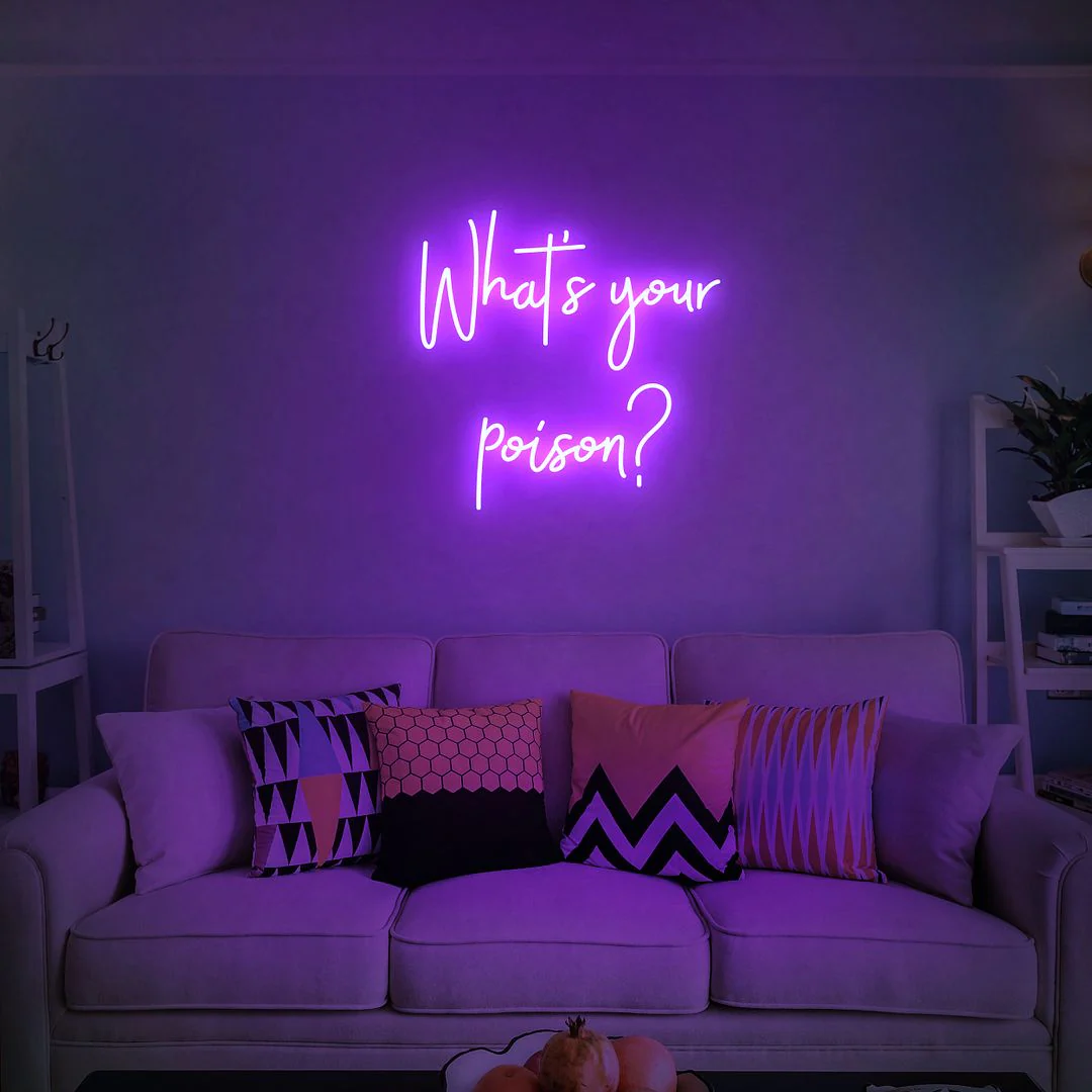
Color Choice and Mood Control
Color strongly influences how a custom neon sign feels in a space.
General guidance:
-
Warm tones feel inviting and relaxed
-
Cool tones feel calm but distant
-
Highly saturated colors feel energetic but can cause visual fatigue
Neon often appears different in real lighting than in digital previews, making color testing and context important.
Where Custom Neon Signs Usually Work Best
-
Living rooms: As a single focal accent
-
Bedrooms: For soft ambient lighting
-
Home offices: As a subtle motivational or symbolic element
Neon tends to perform poorly in spaces already filled with strong lighting contrasts or heavy visual detail.
Practical Limitations to Keep in Mind
Despite their appeal, custom neon signs have real drawbacks:
-
Trend-driven designs may age quickly
-
Constant illumination may not suit all spaces
-
Installation requires planning for power and mounting
-
Dust and cleaning still matter
Understanding these limits helps ensure neon is used intentionally.
Final Thoughts
A custom neon sign works best when it supports the room rather than competes with it. Success depends on scale, color, placement, and whether the sign aligns with the room’s purpose and atmosphere.
Neon should be treated as a design tool—not a shortcut. When used thoughtfully, it can add warmth and personality. When used impulsively, it can feel distracting or dated.
FAQ: Custom Neon Signs for Home Decor
Are neon signs suitable for all home styles?
No. Neon works best as an accent and may clash with highly traditional or heavily decorated interiors.
Is a custom neon sign better than a pre-made one?
A custom neon sign offers better control over size, color, and message, making it easier to match specific decor styles.
Do neon signs make a room too bright?
They can. Brightness depends on color, size, and placement. Many rooms benefit from softer tones rather than vivid colors.
Where should I avoid placing neon signs?
Avoid areas with excessive visual clutter, strong glare, or where constant light may be disruptive, such as directly facing a bed.
Do neon signs require a lot of maintenance?
Maintenance is minimal, but regular dusting and careful handling help preserve appearance and brightness.