


Which Neon Color Is Best? My Honest Take After Testing
When I ordered my first custom neon sign, I thought the hardest part would be picking the design. Turns out, choosing the color is what really makes or breaks how the sign looks in your space. After testing a few options in real settings (bedroom, office, and even outdoors), here’s what I learned about neon colors — the good, the bad, and the surprising.

The Classic Question: Is There Really a "Best" Neon Color?
Honestly, there isn’t a universal “best” color. It all depends on your space, purpose, and lighting conditions. Some colors look bold and stunning at night but completely wash out in daylight. Others are versatile but lack the personality you might expect when you think “neon.”
I’ll break down my experience with the most popular colors.
Pink – Playful but Risky
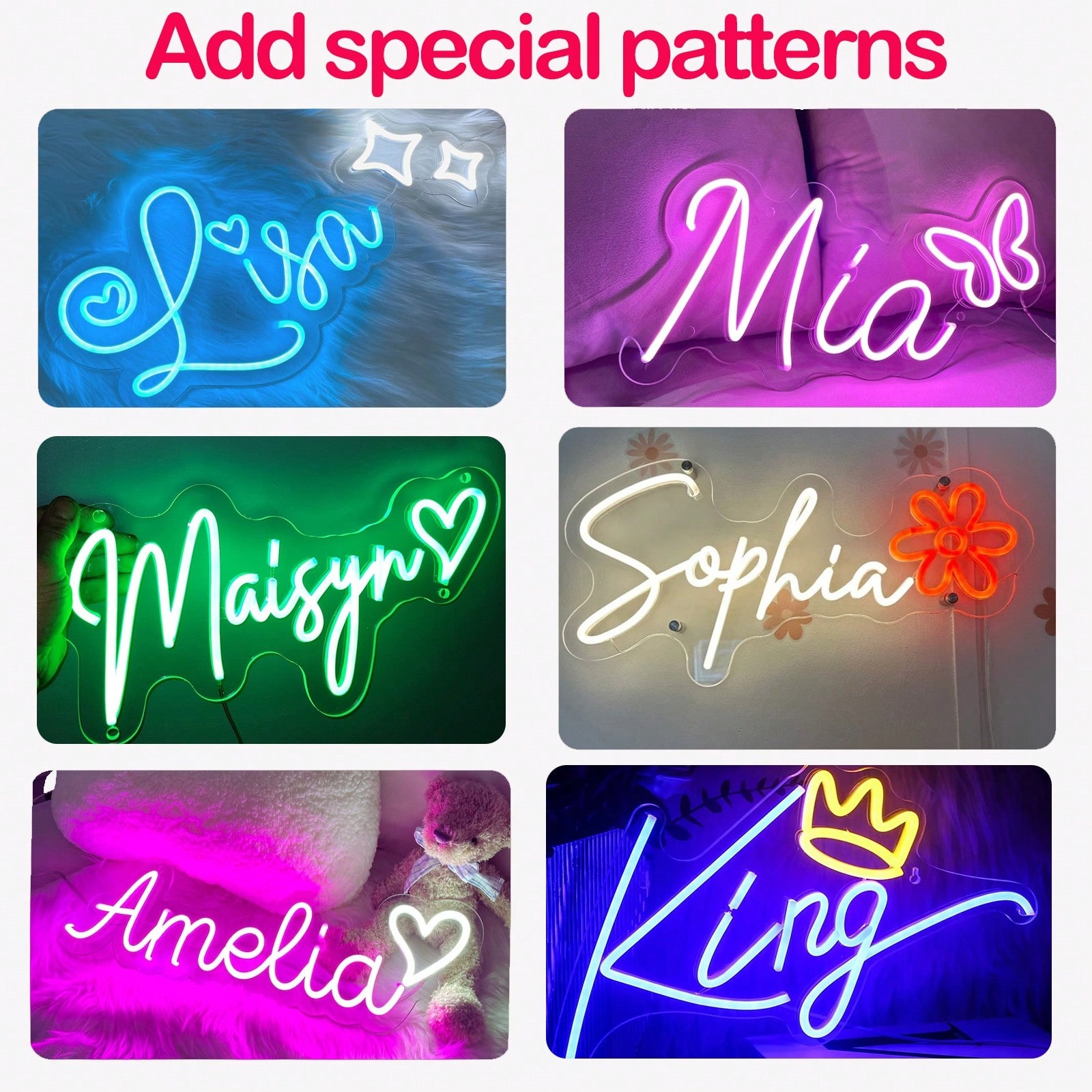
Pink is one of the most popular neon colors, and I get why. It feels fun, romantic, and instantly eye-catching. In low light, it glows beautifully and gives any room that “Instagrammable” vibe.
But here’s the catch: in bright rooms, especially with natural light, pink can fade and even look purplish depending on the wall color. If you’re planning to take photos or host events during the day, pink might disappoint you.
✅ Best for: bedrooms, salons, parties
❌ Downside: can lose intensity in daylight
Blue – Cool and Modern, But Sometimes Too Subtle
Blue (especially ice blue) has a sleek, calming feel. In my office setup, it looked futuristic and matched perfectly with my minimalist décor.
However, I quickly realized that lighter shades of blue can look almost white in bright light. Also, blue doesn’t “pop” as much as warmer colors in photos — it can blend into the background more than you’d expect.
✅ Best for: gaming rooms, offices, minimalist spaces
❌ Downside: can look washed out in sunlight
Red – The Loudest of Them All
Red is powerful — no question about it. In a dark room, it’s intense, bold, and dramatic, almost like a nightclub vibe. It’s perfect if you want your sign to stand out.
The downside? Red can be too much. It’s so strong that it can strain your eyes if you’re sitting close for too long. Also, depending on your background, red can sometimes blur or glow so much that the text becomes harder to read.
✅ Best for: bars, restaurants, bold décor
❌ Downside: overwhelming in small or cozy spaces
White – Safe, Versatile, and Timeless
If you’re unsure, white is the little black dress of neon signs. Warm white gives a cozy, vintage vibe while cool white feels modern and sharp. I found warm white especially flattering in photos — it makes skin tones look great, which is why it’s so popular for weddings.
Still, white isn’t perfect. On light-colored walls, it can disappear when turned off, and in daylight it sometimes lacks the “wow” factor compared to colored neon.
✅ Best for: weddings, home décor, logos
❌ Downside: can look too plain if you want boldness
Green and Yellow – Fresh but Tricky
Green feels energetic and natural, while yellow radiates positivity. Both looked great in darker rooms, but in daylight I noticed a problem: green can look too fluorescent, and yellow sometimes shifts toward a greenish tint. If you’re picky about color accuracy, this can be frustrating.
✅ Best for: playful, retro, or eco-themed spaces
❌ Downside: not always consistent in photos
Purple – Underrated and Atmospheric
Purple was the biggest surprise for me. It’s not as common as pink or red, but it feels luxurious, moody, and creative. In low-light settings, purple signs are gorgeous and add a unique ambiance.
The only negative? Purple doesn’t perform well in bright environments. It’s definitely a nighttime or indoor color.
✅ Best for: bars, creative studios, cozy bedrooms
❌ Downside: easily fades in daylight
Check More Custom Neon Signs from Kstom
For More Please Read :
Color choice depends on where and how a sign will be used, something clearly explained in this neon signs explained guide.
My Verdict: Think Context, Not Favorites
After testing, I don’t believe there’s a single “best” neon color. The right choice depends on three things:
-
Lighting – Is it mostly day or night use?
-
Purpose – Do you want bold attention or soft ambiance?
-
Background – Does it contrast well with your wall or backdrop?
If I had to recommend safe bets:
-
Warm white for timeless, elegant settings (especially weddings).
-
Pink for playful, modern vibes.
-
Red if you need maximum impact.
-
Purple if you want something atmospheric and different.
When neon signs are used as décor or gifts, color becomes even more important, especially for personalized neon signs.
When I first got my neon sign, I was convinced bright colors like red or pink would be the best. But after living with them, I realized it’s more about how the color fits the space than how cool it looks online.
My advice? Don’t just pick your favorite color. Consider how it will look in your actual room, both day and night. And if possible, ask the supplier for real photos in different lighting — because trust me, the mockups don’t always tell the truth.